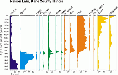
The x (horizontal) axis shows the percent of total pollen (20%, 40%, 60%, etc) for each of the taxa (plant types) displayed.
The y (vertical) axis shows age (time) and sometimes depth of sediment.
The Nelson Lake pollen diagram shows how regional plant communities changed from 18,000 years ago through the present. The time scale was established through radiocarbon dating of material found in the lake sediments, and the original radiocarbon dates were converted to calendar years.